Gauntlet Gallery
What is Shepard Fairey’s piece called “Wreath”?
Artist Statement
WREATH Screen Print 18 x 24 inches Edition of 200 When I went to Hong Kong in 2001, I bought a propaganda booklet that Chairman Mao had issued to every household, and it was just two-color spot printing, black and red on off-white paper. A lot of the graphics were just red on off-white, but they were very striking. I decided to challenge myself to create such strong images while restricting myself to work in one color like that. I did a few different images in that format, and it seemed to really befit powerful seals and symbols such as this wreath. This print is based on the Coat of Arms of the Soviet Union.
Summary
Wreath is a 2001 Shepard Fairey screen print published by Obey Giant in a first edition of 200, measuring 18 x 24 inches. By Fairey's own account it grew from a 2001 trip to Hong Kong, where a two-color Maoist propaganda booklet (black and red on off-white) inspired him to challenge himself with a single restricted color palette. The image is based on the Coat of Arms of the Soviet Union, treating a powerful state seal in his propaganda-poster idiom. The record documents medium, year, dimensions, edition, and a detailed artist statement, giving strong grounding for the imagery and intent.
Why It Matters
Wreath is one of the better-documented prints of Fairey's 2001 output, and its artist statement makes it especially valuable to collectors. Fairey describes how a Maoist propaganda booklet he encountered in Hong Kong, printed simply in black and red on off-white paper, pushed him to work within a single restricted color scheme, and how that constraint suited powerful seals and symbols. Basing the image on the Coat of Arms of the Soviet Union places it squarely in his ongoing engagement with the aesthetics of state propaganda, appropriating authoritarian iconography to examine how such imagery commands attention. For collectors, this matters because it shows Fairey explicitly theorizing his own method, the deliberate adoption of communist visual language and minimal-color spot printing that defines much of his propaganda work. The edition of 200 gives it relative scarcity within the period. Its database value is high precisely because the source supplies real intent rather than inference, letting the entry connect technique, source material, and meaning. This is the kind of self-documented print that anchors a collection focused on Fairey's propaganda-aesthetics, and it pairs naturally with his other Mao- and seal-based works.
Collector Perspective
Wreath appeals to collectors fascinated by Fairey's appropriation of state-propaganda aesthetics and by his technical experiments with restricted color. The documented origin story, a Hong Kong Maoist booklet and a deliberate single-color challenge, adds narrative depth that display-minded buyers prize. At 18 x 24 inches with a striking red-and-off-white seal, it frames boldly and reads strongly from a distance. The edition of 200 gives completists relative scarcity, and the Soviet Coat of Arms subject anchors a themed grouping around communist iconography and power. It is a strong fit for collectors who want a piece that pairs visual punch with a clearly stated conceptual basis.
Historical Context
Wreath dates to 2001 and emerged directly from Fairey's trip to Hong Kong that year, where a two-color Maoist propaganda booklet prompted his experiment with single-color spot printing. Basing the image on the Coat of Arms of the Soviet Union, it belongs to his posters-and-propaganda phase and to his sustained appropriation of communist and authoritarian iconography, a thread that also runs through his Mao-based works. The print exemplifies how, at this stage, Fairey was consciously mining the look of state propaganda, black and red on off-white, to make seals and symbols feel commanding while questioning the power they represent. Its detailed artist statement firmly situates it within this deliberate, method-driven period of his career.
FAQ
What is Wreath based on?
According to Fairey's statement, the print is based on the Coat of Arms of the Soviet Union. He rendered it in a restricted color palette inspired by a Maoist propaganda booklet he bought in Hong Kong in 2001, printed in black and red on off-white paper.
Why did Fairey use only one color?
Fairey says he challenged himself to create strong images while restricting his palette, after seeing how striking the two-color (and often single-color) Maoist booklet looked. He found the minimal approach especially suited powerful seals and symbols like this wreath.
What is the edition size and how large is the print?
Wreath is a first edition of 200 copies, measuring 18 x 24 inches. It was published by Obey Giant in 2001 as a screen print.
How scarce is this print?
With an edition of 200, it is moderately scarce relative to Fairey's later large-run prints. The source does not state it is sold out, and no auction or market value is recorded in the data.
Related Works


About the Artist

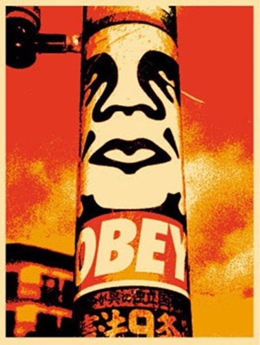
Shepard Fairey (b. 1970, Charleston, South Carolina) is an American street artist, graphic designer, and activist, and a graduate of the Rhode Island School of Design. His 1989 “André the Giant Has a Posse” sticker grew into the global OBEY GIANT campaign — an ongoing experiment in propaganda, obedience, and visual culture. He reached worldwide recognition with the 2008 “Hope” portrait of Barack Obama, now held by the Smithsonian National Portrait Gallery. Across screen prints, stencils, murals, and collage, Fairey channels propaganda aesthetics toward themes of peace, justice, environmentalism, and civil rights. His work is in the collections of the Museum of Modern Art, the Victoria & Albert Museum, and LACMA.